Often Overlooked Accessibility Practices
Something that really stood out to me from this week’s content is how many accessibility practices are actually simple to do, yet they still get overlooked a lot. Small things like adding alt text to images, using proper headings so readers can move through a page more easily, and writing descriptive links instead of just saying “click here” can make a big difference. When I reflect on my own uses sometimes I overlook things like alt text with images, especially when I’m quickly putting together slides or posting something online. It’s not intentional, it just isn’t something that automatically comes to mind unless you’ve been taught to think about accessibility while designing. This really shows how important it is to build awareness around accessibility. When people start considering it from the beginning, these small steps can easily become part of their normal routine and help make online spaces more accessible for everyone. I think it just highlights the importance of being (slightly) more detail oriented.
Why do you think many digital accessibility practices aren’t more well-known or commonly used?
I think a lot of digital accessibility practices aren’t very well-known because people simply do not learn about them. Although there has been a lot of positive progression in the world of accessibility, I think the digital version of it somewhat “flies under the radar”. I don’t think this is intentional whatsoever. Details on digital resources need to be a little more inclusive and deliberately laid out. It can be simple things such as an extra line of descriptive text, allowing all forms of readers to navigate a resource more easily. For a small example here is a photo with a descriptive caption and link below.
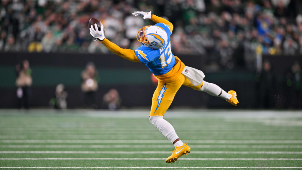
One of my favourite football players of all-time, Keenan Allen, making a miraculous one-handed catch. https://www.nfl.com/videos/can-t-miss-play-keenan-allen-submits-bid-for-catch-of-the-year-on-spinning-grab